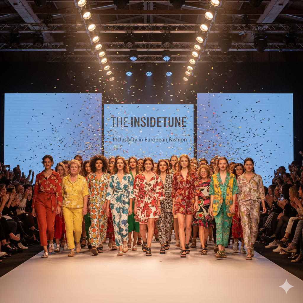
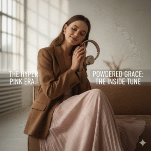
The Power of Pink and Brown: Decoding the Earthy Romance Dominating Europe’s 2025 Fashion Landscape
Introduction: The Calibration of Consciousness and the New Axis of Elegance
The Post-Polycrisis Aesthetic
Europe’s fashion scene in 2025 is more than just new color palettes—it’s a recalibration of consciousness. After years of global turbulence and “polycrisis” anxiety, people crave reassurance in what they wear. Clothing is no longer just style—it’s therapy, a stabilizer for the self.
Gone are the days of dopamine dressing, with neon highs and fleeting thrills. Instead, consumers are investing in pieces that feel grounded, timeless, and emotionally supportive. Colors that communicate continuity, rather than chaos, are at the heart of this movement.
This explains the magnetic rise of the Pink and Brown axis. Together, they provide not just aesthetic pleasure but psychological calm—making them the perfect allies for a Europe navigating complexity with cautious optimism.
The Great Pivot: From Hyper Pink to Powdered Grace
The Barbiecore Afterglow
We all remember the pink explosion of Barbiecore—loud, joyful, and unapologetically maximalist. But such high-voltage saturation, while culturally iconic, couldn’t sustain long-term relevance in luxury and investment fashion.
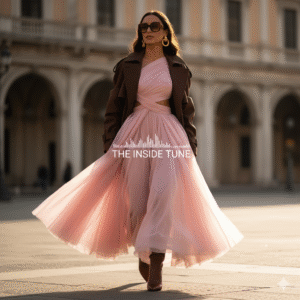
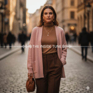
2025 is about refinement. Hyper Pink hasn’t disappeared; it’s simply matured, surviving only in accents and playful accessories. The real star is a softer evolution: Powder Pink or Petal Pink, airy yet dignified.
By lowering the pigment, pink has graduated from a sugary trend into a versatile neutral. Now it carries elegance across categories—luxury tailoring, eveningwear, and even corporate dressing. Pink has, quite literally, grown up.
The Pink and Brown Thesis: Complementing the Contradiction
Brown: The Anchor of Reality
Rich, earthy browns speak to stability, resilience, and grounding. They remind us of permanence—soil, wood, and tradition—at a time when permanence feels rare. Brown delivers trustworthiness in fashion form.
Pink: The Aspirational Softness
Meanwhile, the softened pink offers emotional release. It’s playful yet sophisticated, optimistic yet gentle. Psychologists note this shade taps into a yearning for joy without chaos—childlike comfort, but filtered through adult elegance.
Together: A New Neutral Axis
Pink and Brown thrive not on contrast, but on harmony. Brown steadies pink’s volatility, while pink lightens brown’s gravity. This balance creates a warmer alternative to the stark black-and-white binary that has long ruled fashion.
The result is a palette that is modern, romantic, and deeply human. In uncertain times, it offers both investment appeal and emotional satisfaction—the true markers of enduring style.
🌸 The Forensic Forecast: Anchoring Pink & Brown in Professional Data
Fashion in 2025 isn’t just about trends. It’s about survival, recalibration, and emotional reassurance. After years of global instability—pandemics, climate anxiety, shifting economies—the colors we wear have become more than just style choices. They’ve become emotional anchors.
This is why Pink and Brown are not just “in fashion.” They are the palette of our collective psyche. Their rise is not anecdotal but confirmed by the most authoritative voices in trend forecasting, from Pantone to WGSN. The story they tell is one of balance: grounding earth tones softened by romantic pastels, creating a wearable harmony that reflects both the seriousness and hope of our times.
☕ Mocha Mousse: Pantone’s Grounding Force
At the center of this color revolution is PANTONE 17-1230 Mocha Mousse. This isn’t just a brown—it’s an experience. It conjures the comfort of a morning coffee, the indulgence of a rich chocolate truffle, the calm of earth beneath your feet.
Pantone positioned Mocha Mousse as more than a neutral. It’s a psychological balm, chosen explicitly to soothe, ground, and reassure. Their Color Institute describes it as a shade that helps us “find harmony in an ever-changing world.” At a time when uncertainty defines daily life, that message resonates deeply.
But what makes Mocha Mousse brilliant is its subtle pink undertone. This isn’t a flat, utilitarian brown—it’s brown with warmth, with life. That quiet pink flush ensures it feels modern, eliminating the risk of looking dated or heavy. It’s the genetic bridge that legitimizes the pairing of brown and pink, ensuring the duo feels both natural and elevated.
This aligns with a prophecy voiced years ago by trend oracle Lidewij Edelkoort, who declared: brown will become the new black. Mocha Mousse now assumes that mantle, offering all the versatility of black but with greater softness and emotional intelligence. It’s brown, but brown reimagined for a gentler, more human era.
🌌 The Dark Continuum: Future Dusk & Emotional Depth
Pantone wasn’t the only authority to weigh in. Forecasting giants WGSN and Coloro chose Future Dusk—a mysterious, twilight shade between blue and purple—as their Color of the Year 2025.
If Mocha Mousse is comfort, Future Dusk is curiosity. It embodies transition, mystery, and the liminal space between endings and beginnings. It’s a color that asks us to dream while staying grounded.
Together, these shades form what analysts call the Dark Continuum. Consumers no longer want stark black—they want darks with depth and narrative. Future Dusk offers escapism. Mocha Mousse offers reassurance. Both are versatile, gender-inclusive, and timeless. And both answer the same consumer need: to feel safe while navigating change.
🌷 Pink’s Evolution: From Barbiecore to Boardroom
No color tells a cultural story like pink. Its journey is almost cinematic.
-
2023–2024: Pink reached its cultural peak with Barbiecore—a maximalist explosion of hyper-saturated fuchsia. It was playful, political, and pop-driven, but ultimately, it was unsustainable. Consumers fatigued quickly, recognizing its novelty but not its longevity.
-
2025: Enter Powder Pink / Petal Pink. This new pink is everything Barbiecore wasn’t—quiet, refined, and enduring. It’s sophisticated enough for investment pieces yet soft enough to soothe. It offers nostalgia without naivety, romance without frivolity.
What makes Powder Pink revolutionary is its new role as a neutral. It’s no longer a “fun accent.” It sits confidently alongside navy, taupe, and beige, proving itself in boardroom tailoring as much as in evening dresses.
Psychologically, Powder Pink answers a craving for gentle optimism. It’s not about escape, but about elegant resilience. It reassures while uplifting—exactly what consumers need now.
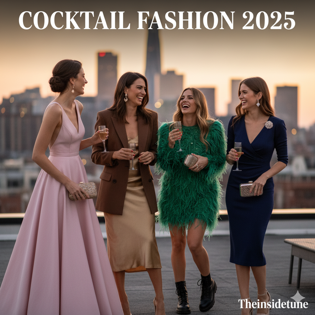
👠 Runway Proof: LFW, MFW, PFW SS25
Runways across Europe’s Spring/Summer 2025 shows confirmed the forecast with striking consistency.
-
London Fashion Week (LFW): Designers like Burberry and Khaite showcased Soft Petal Pink against burgundy and chocolate, making the shade feel chic, not saccharine. The palette celebrated romance grounded in reality.
-
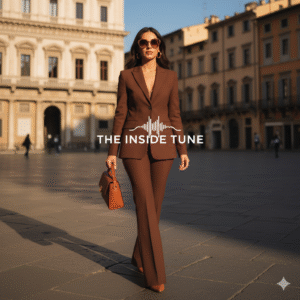
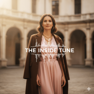
Milan Fashion Week (MFW): Street style favored caramel browns, while Fendi cemented the pairing by presenting Salmon Pink + Chocolate Brown. The result? A duo that felt luxurious, commercial, and universally wearable.
-
Paris Fashion Week (PFW): Latte dressing dominated: rich browns layered like coffee art, paired with delicate pastels. It was elegance in motion—warm, inviting, and resolutely sophisticated.
From the streets of Milan to the salons of Paris, the message was clear: Pink and Brown aren’t niche—they’re mainstream, luxury-certified, and globally relevant.
📊 The New Neutrals: Forecasting’s Unified Palette
| Shade Name | Color Family | Mood / Association | Forecast Source | 2025 Applications |
|---|---|---|---|---|
| Mocha Mousse (PANTONE 17-1230) | Rich Brown/Taupe | Comfort, Stability, Sensorial Warmth | Pantone | Tailoring, Outerwear, Investment Staples |
| Powder Pink / Petal Pink | Soft Pink | Optimism, Sophistication, Gentle Nostalgia | Runway Analysts | Silks, Daywear, Neutrals in Corporate Wear |
| Future Dusk | Blue-Purple Dark | Mystery, Reassurance, Futuristic Transition | WGSN/Coloro | Gender-Inclusive Classics, Eveningwear |
| Chocolate Brown | Earthy Brown | Neutral Refinement, Latte Dressing, Wearability | MFW Street | Leather Goods, Knitwear, Accessories |
| Orchid Pink | Vivid Deep Pink | Bold Energy, Maximalist Accent | Beauty/Fashion | Color Blocking, Statement Pieces |
🌍 Beyond the Runway: Culture & Lifestyle Echoes
The influence of Pink and Brown isn’t confined to fashion—it’s shaping wider lifestyle aesthetics.
-
Interiors: “Latte living” is trending—caramel couches, mocha-toned walls, blush throws. Homes are being designed to feel like safe, cocooning spaces.
-
Beauty: Powder pink blushes, chocolate lipsticks, and soft brown eyeliners dominate runways and retail counters alike. Even hair color trends lean toward rose-tinted brunettes.
-
Technology: Tech design is softening. Brands are shifting toward taupe casings, muted rose wallpapers, and calm interfaces. Even devices now speak the language of soothing design.
This cultural ripple effect proves the palette is more than aesthetic—it’s a code of emotional living. Pink and Brown aren’t just colors. They’re a lifestyle philosophy: stability and softness in equal measure.
✨ Why It Matters
The forensic forecast tells a bigger story: fashion is psychology in color form.
-
Brown grounds us when the world feels unstable.
-
Pink uplifts us when the future feels uncertain.
-
Together, they create a palette that feels safe, human, and quietly luxurious.
2025’s Pink and Brown movement is not about fleeting style. It’s about a collective desire for balance—to be both strong and tender, serious and optimistic. And in that sense, it’s not just a trend. It’s a reflection of who we are becoming.
🤎 The Architectural Brown: Earthy Elegance & the Retro Synthesis
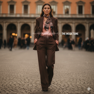
For years, brown was the wallflower of fashion—practical, safe, and often overlooked in favor of sharper neutrals like black or gray. But 2025 has changed everything. Across runways, in street style, and inside luxury boutiques from Paris to Milan, brown is having its renaissance moment. It’s no longer the “boring” neutral—it’s the architectural color of the European wardrobe, the quiet force shaping how we dress, layer, and invest in fashion for the long term.
Brown today is not just a color. It’s a statement of permanence, authenticity, and emotional grounding. In an age of instability, it reassures us—wrapping us in the warmth of heritage, nature, and nostalgia while still feeling modern and endlessly versatile.
☕ Brown as the Epitome of Luxurious Stability
Let’s be honest: the fashion consumer of 2025 has changed. After years of fast cycles and fleeting “viral” trends, shoppers are investing with more care. The focus is shifting to longevity, craftsmanship, and emotional value.
Brown naturally answers this call. Shades like Mocha Mousse, Caramel, Toffee, and Chocolate feel timeless, echoing the richness of leather, aged wood, coffee, and cocoa. They carry an aura of luxury without shouting for attention.
In Europe especially, where heritage quality is prized over disposability, brown is becoming the default for investment pieces. Whether it’s a Max Mara camel coat, a Bottega Veneta leather tote, or a pair of Saint Laurent chocolate boots, these shades project stability, wealth, and quiet sophistication.
Brown doesn’t just clothe—it anchors wardrobes, offering a reliable base to build on season after season.
🍵 The Latte Dressing Continuum
One of the clearest expressions of brown’s dominance is the rise of latte dressing. Imagine a wardrobe layered like your favorite coffee order: espresso coats, caramel trousers, mocha knits, and cream scarves. No sharp contrasts—just tonal harmony that feels effortlessly elegant.
This is European sophistication distilled: understated, tonal, and endlessly chic. Think of Milanese street style stars layering coffee-inspired shades in a way that feels more powerful than head-to-toe black.
And here’s the quiet genius—soft pink fits perfectly into this palette. Powder pink becomes the “foam on top” of the latte, a gentle highlight rather than a competing color. Instead of clashing, it blends, making the pink-and-brown pairing look organic, not forced.
🌿 Retro Seventies Revival: Shades With History
Another reason brown feels so right in 2025? Nostalgia. Fashion is leaning heavily into the 1970s revival, and brown was the defining color of that decade.
Shades like Turtle Shade, Iced Coffee, Rum Runner, and Pearly Brown recall retro interiors, flared trousers, suede jackets, and warm bohemian palettes. This retro undertone isn’t just aesthetic—it’s psychological reassurance.
The 70s symbolize authenticity, craft, and a slower pace of life. In today’s “polycrisis” era, where everything feels uncertain, tapping into that nostalgia feels safe, grounding, and even hopeful. By wearing brown, we aren’t just embracing fashion—we’re connecting to a collective memory of stability and authenticity.
🧘 Psychology of Grounding: Fashion as an Antidote
Colors carry moods, and brown is the mood stabilizer of fashion. Forecasters describe it as “the perfect antidote to today’s hectic lifestyles.” And it makes sense—brown connects us to earth, wood, soil, and natural cycles.
When life feels fast, chaotic, and digital, putting on brown—whether it’s a soft cashmere sweater, structured leather jacket, or suede boots—feels like a return to solid ground. It’s tactile, familiar, and comforting.
This psychological grounding makes brown universally wearable:
-
Minimalists love it with crisp whites, ivory, or other browns.
-
Bold dressers elevate it with powder pink, ochre, or even cobalt blue.
It’s the rare neutral that feels dependable without being boring.
👗 Texture & Materiality: Brown in Motion
One of the reasons brown shines in 2025 is its relationship with texture. Unlike black, which can flatten fabrics, brown reveals materiality—it makes leather richer, suede softer, wool cozier, and silk warmer.
Expect to see brown dominate in:
-
High-quality leathers & suedes: structured handbags, outerwear, riding boots.
-
Dense wools & fine-gauge cashmere: sophisticated tailoring and layering staples.
-
Rich brown denim: a retro revival in trousers, skirts, and jackets.
Brown in these materials doesn’t just look chic—it feels luxurious, reminding us that fashion can be both tactile and emotional.
🌱 Sustainability Synchronization: Brown as an Ethical Neutral
Perhaps the most powerful reason for brown’s dominance lies in its connection to sustainability. Earth tones naturally signal eco-consciousness, and designers are using them to showcase natural, responsible materials.
Brown pairs seamlessly with fibers like:
-
Pure Linen → breathable and low-impact.
-
Bamboo Silk → eco-luxury with a soft hand.
-
Recycled Cotton & Wool → circular, responsible, future-proof.
Here’s the magic: brown amplifies the authenticity of these fabrics. A recycled wool coat looks proud in chocolate brown. A linen dress in taupe feels organic. Even when paired with glossy synthetics or pink satins, the brown base keeps the overall palette grounded and responsible.
In a European market where sustainability is fast becoming a mandate, not a trend, brown positions itself as the inherently ethical choice—luxury with a conscience.
🤎 Brown’s New Role: From Neutral to Narrative
In 2025, brown is no longer a background player. It is the architectural foundation of fashion. It embodies:
-
Luxury with restraint.
-
Stability in uncertainty.
-
Sustainability with authenticity.
-
Nostalgia with modern relevance.
Paired with soft pink, brown gains a romantic tenderness. Layered tonally, it becomes the backbone of latte dressing. Woven into heritage fabrics, it tells a story of durability and authenticity.
More than just a neutral, brown has become a narrative—a color that reflects the way we want to live now: grounded, mindful, and timeless.
🌸 The Romantic Pink: Soft Power, Subversive Glamour & The New Neutrality
Few colors in fashion have been as contested, coded, and culturally loaded as pink. Once dismissed as frivolous or overly feminine, pink in 2025 has reinvented itself as the quiet disruptor of the wardrobe. No longer confined to Barbiecore maximalism or kitschy pastels, today’s pink is refined, versatile, and quietly radical.
This new iteration, led by Powder Pink and Petal Pink, has transcended stereotypes to become what fashion insiders now call the “new neutrality.” When paired with brown, it doesn’t scream—it whispers, grounding itself in sophistication while still offering a dose of joy. In an uncertain world, pink has become the soft power color of the decade.
✨ The Triumph of Powder Pink: Anti-Saccharine Sophistication
The defining shift is restraint. Gone are the hyper-saturated pinks of Barbiecore, which thrilled Instagram but exhausted wardrobes. Instead, Powder Pink and Petal Pink dominate with an ethereal, dialed-down elegance. Analysts liken them to a “Glinda pink”—gentle, airy, and touched with light.
These shades deliberately avoid the trap of saccharine sweetness. They’re not the bubblegum of Y2K nostalgia, nor the childish pastels of nursery walls. Instead, they are grown-up neutrals, able to slip seamlessly into tailoring, eveningwear, and even corporate wardrobes.
In other words: pink has finally shed its reputation as a seasonal novelty and secured its place as an investment color—one that signals subtle glamour, not frivolity.
👠 Runway Validation & The Psychology of Relief
The Spring/Summer 2025 runways confirmed pink’s transformation. Miu Miu, Alaïa, Jil Sander, and Khaite all wove Powder Pink into their collections. Khaite, in particular, showcased the color as a core neutral, pairing it with deep burgundy and black—proof that it can sit confidently alongside traditional power shades.
But what makes this pink so powerful is not just aesthetics—it’s psychology. After years of seriousness, austerity, and global instability, consumers are yearning for softness, nostalgia, and escape. Powder Pink delivers just that.
It’s the color equivalent of a sigh of relief: optimistic without being loud, playful without being childish. Psychologists note it offers an emotional release valve, giving us permission to indulge in lightness while keeping one foot grounded in reality.
Think of it as fashion’s wellness color—a gentle dose of optimism woven into the wardrobe.
👑 Historical Context: Pink’s Aristocratic Roots
To understand pink’s current sophistication, we need to revisit its history. For centuries, pink wasn’t seen as frivolous—it was seen as aristocratic.
In 18th-century Europe, both men and women wore powdered pink silks, embroidered waistcoats, and Rococo interiors adorned with pink flourishes. It was a symbol of refinement, luxury, and power, not just femininity. In fact, pink was often considered masculine—seen as a lighter version of red, the color of strength and courage.
It wasn’t until the post–World War II consumer boom that pink was firmly coded as feminine, thanks in part to mid-century marketing strategies and gendered advertising. That narrow definition stuck for decades.
By reintroducing Powder Pink as a serious neutral, the 2025 market is reclaiming its aristocratic prestige. Fashion is saying: pink is not just for girls; it’s for everyone, and it belongs in luxury tailoring as much as in romantic silks. This historical reappropriation gives pink the longevity it once lacked.
🌺 Pink’s Maximalist Potential: Orchid & the Bold Accent
Of course, not all pinks are whispering. Alongside the gentle neutrals, a maximalist countercurrent thrives. Enter Orchid Pink—a vivid, electrifying hue that turns heads instantly.
Orchid Pink is gaining traction particularly in hair, beauty, and statement accessories. From bold faux-furs at GCDS SS25 to glossy handbags and even streaks of hair dye, it represents pink at its most dramatic.
This duality is critical. For risk-averse consumers, Powder Pink offers quiet sophistication. For bold personalities, Orchid Pink provides the visual drama needed to stand out in an oversaturated fashion landscape.
The beauty is that they coexist harmoniously. Powder Pink grounds wardrobes, while Orchid Pink injects playful bursts of energy—a one-two punch that appeals across demographics.
💎 Subversion & Glamour: Soft Meets Strong
Here’s where things get interesting: designers are not using pink just to look “pretty.” They’re using it to subvert expectations.
Take Alaïa’s SS25 collection: Powder Pink appeared in sculptural cutouts and daring parachute silhouettes. The softness of the color played directly against the strength of the design—creating tension, glamour, and edge.
This strategy is vital. By pairing pink with strong tailoring, leather separates, or architectural cuts, designers neutralize its sweetness. Pink becomes not a symbol of fragility, but a tool of subversive glamour.
When rendered in silks, organza, and satin, Powder Pink evokes Grace Kelly–level elegance. But pair it with chocolate brown, sharp suiting, or tough textures, and it transforms into a modern power color—softening the silhouette without weakening it.
This is why pink is thriving in corpcore dressing: as a gentle counterpoint to structure, authority, and formality.
🌸 Pink in 2025: The Soft Power Color
Pink’s reemergence in 2025 can be summarized in three powerful shifts:
-
From Saccharine to Sophisticated → Powder Pink redefines itself as a neutral, not a novelty.
-
From Feminized to Fluid → Reclaiming pink’s aristocratic history restores its genderless versatility.
-
From Pretty to Powerful → Strategic pairings with tough silhouettes and dark neutrals give pink subversive edge.
Together, these shifts make pink more than just a color trend—it’s a cultural reset.
Pink is no longer asking for permission. It’s quietly commanding space in tailoring, redefining elegance in eveningwear, and offering comfort in day-to-day dressing. It is soft power in color form—gentle, glamorous, but never to be underestimated.
5. The European Runway Blueprint: Texture, Aesthetics, and Ethical Integration ✨
The story of pink and brown in 2025 isn’t just about color — it’s about how those shades feel on the body, how they interact with one another, and how they reflect the values of a changing fashion world. In Europe especially, where style has always been about both refinement and responsibility, the success of this palette comes down to a delicate balancing act: textures, aesthetics, and ethics working in harmony.
Texture Matters: When Soft Meets Strong 🌸🤎
Pairing pink and brown could feel predictable — unless you let fabrics do the heavy lifting. The real magic of this duo is found in texture contrast, where one color whispers and the other anchors.
💗 Pink Textures: Lightness & Movement
Think silks, satins, organza — fabrics that glide, shimmer, and bring a sense of escape. Satin, in particular, is having a comeback — not just for evening gowns but for everyday pieces that feel polished yet effortless. These materials embody softness, fluidity, and romance — like a breath of fresh air in a fast-paced world.
🤎 Brown Textures: Weight & Stability
On the flip side, brown thrives in fabrics with structure: tailored wool, dense cashmere, rich suede, sturdy denim, and heritage-quality leather. These give garments that reassuring sense of permanence — like an investment piece that only gets better with age.
✨ Together, they create balance: pink feeds the heart with dreaminess, brown grounds the head with durability. Imagine a mocha wool coat thrown over a powder-pink silk blouse — suddenly, the outfit tells a whole story of strength and softness, discipline and romance.
Minimalism vs. Maximalism: A European Balancing Act ⚖️
For the last decade, minimalism ruled European fashion — all monochrome palettes, clean lines, and understated “quiet luxury.” But by 2025, many consumers are ready for more personality in their wardrobes.
-
🌟 Maximalist Sophistication (London/Paris vibes): Plush faux-furs in bubblegum pink over chocolate-brown trousers, or vibrant orchid-pink accessories against deep suede. “More is more,” but in a way that feels rich and character-driven rather than chaotic.
-
☕ Soft Minimalism (Milan/Copenhagen vibes): Latte layers of mocha, caramel, and blush — subtle tonal shifts, sleek tailoring, and refined layering. Calm, chic, and enduringly elegant.
This flexibility is exactly why the pink-and-brown palette works so well. It bends to different cultures and moods, whether you’re an eccentric London dresser or a Milanese professional chasing architectural lines.
Fashion with a Conscience 🌍♻️
No trend in 2025 can escape the sustainability conversation — and luckily, pink and brown are perfectly positioned to meet that demand.
🤎 Brown: The Natural Story
Brown is the color of soil, bark, and raw fibers, making it the ideal canvas for sustainability. Organic linen, hemp, recycled wool, and bamboo fabrics not only look luxurious but also send the message: this is fashion that cares. A caramel wool coat in recycled fibers isn’t just a coat — it’s a philosophy of mindful consumption.
💗 The Pink Dilemma — and Innovation
Pink is trickier. Its most glamorous looks depend on sheen and shine, which historically relied on synthetics. But innovation is catching up: bamboo silk and Tencel now give designers that fluid shimmer without the ecological guilt. Plant-based dyes and closed-loop production methods mean pink can keep its drama while staying responsible.
Together, they strike the perfect balance: brown provides the grounded ethical backbone, while pink gets to shine as the expressive, emotional accent — without compromising values.
Why This Matters ❤️🤎
The European runway blueprint isn’t just about fashion; it’s about modern life. We want beauty without waste, luxury without guilt, individuality without excess. Pink and brown succeed because they speak to both sides of us:
-
🌸 The dreamer who craves romance, optimism, and softness.
-
🌿 The realist who values durability, craftsmanship, and sustainability.
This is why the palette feels bigger than a seasonal trend — it’s almost a new philosophy of dressing. It shows us that fashion can be joyful and responsible, expressive and grounded. And maybe that’s the real lesson of 2025: the future of style belongs to those who know how to balance head and heart.
6. Mastering the Dual Palette: Styling Guides for the Modern European Wardrobe 🌸🤎
Trends come and go, but pink and brown are proving to be more than just a fleeting romance on the runway. Their power lies in wearability. In 2025, this duo has stepped out of the trend forecast and into real wardrobes across Europe. Why? Because when styled thoughtfully, they create a look that feels elegant, approachable, and — most importantly — adaptable.
If you’re looking to master this timeless pairing, here’s how to make pink and brown your chicest allies for day, night, and everything in between.
The Foundational Formula: Anchoring Pink with Brown ⚖️
Think of brown as the anchor and pink as the uplift. The magic happens when darker, weightier browns (chocolate, mocha, espresso) are used as the foundation — trousers, tailored coats, structured knits — while pink comes in as a lighter, optimistic accent.
✨ Example: A silk powder-pink blouse tucked into mocha wool trousers. The balance feels fresh, chic, and sophisticated without veering into saccharine sweetness.
It’s all about contrast: brown keeps things serious, pink keeps things joyful. Together, they strike that elusive European balance between effortless cool and refined elegance.
Chic Casual Combinations ☕🌸
Everyday dressing is where this palette truly shines. Soft pink satin blouses paired with caramel wide-leg trousers are the epitome of Parisian nonchalance. For a more relaxed vibe, a pastel pink tee with oversized brown corduroys nails the 70s revival while staying contemporary.
What makes these outfits work? They’re understated but impactful. You won’t look like you’re trying too hard, but people will notice the quiet sophistication.
Transitional Layering: Depth and Dimension 🍂
Europeans know that layering is both a style necessity and a fashion art form. The pink-and-brown palette thrives here because it naturally lends itself to contrasts in weight and texture.
-
A powder-pink cashmere cardigan over a fine mocha turtleneck.
-
A brown denim jacket layered over a pink wool sweater.
These looks add depth and dimension while keeping you warm during those unpredictable spring or autumn days. The layers don’t just keep you comfortable — they tell a story of balance and subtle complexity.
Accessories: The Silent Game-Changers 👜✨
No look is complete without the right finishing touches. In the pink-and-brown universe, accessories do more than decorate — they define.
🤎 Brown Leather Goods
Structured handbags, sharp belts, and boots in chocolate or turtle-brown ground the sweetness of pink. They make sure the outfit reads as sophisticated rather than girlish.
💛 Metallic Warmth
Gold and bronze accents glow against this palette. A pair of gold hoops or a bronze-buckled belt instantly elevate the look, tying pink and brown together with warmth and polish.
👓 Retro Revival Details
Think 70s-inspired eyewear in shades like Iced Coffee or Pearly Brown. Or a light pink silk scarf knotted at the neck for a subtle nod to color without full commitment. It’s these micro-details that make an outfit feel curated.
From Office to Evening: Versatility at Its Best 🕴️💃
The beauty of this palette? It transitions seamlessly between workday professionalism and evening glamour.
Corpcore Integration
Professional tailoring in brown gets a soft, optimistic lift with just a touch of pink:
-
A dusty rose blouse under a mocha suit.
-
A pink silk lining peeking from a tailored coat.
-
A muted rose scarf against dark brown outerwear.
It’s understated, powerful, and very European.
Evening Wear Elevation
For night, pink steps into the spotlight. Imagine a powder-pink organza gown — ethereal, romantic — paired with structured brown accessories. The contrast gives Grace Kelly–level glamour while keeping the look grounded and modern.
Color Blocking: Subtle vs. Bold 🎨
Here’s where you can have fun with personality.
-
Subtle Blocking: Keep it tonal. Mocha with blush, dusty rose with burgundy. Think continuity rather than contrast. Perfect for Milanese minimalists.
-
Bold Blocking: Go big. Hot pink faux-fur over chocolate brown denim. A neon orchid knit paired with espresso leather. Loud, playful, unapologetic — perfect for London or Berlin.
The best part? This palette spans seasons. Browns work year-round, from heavy winter wools to breezy summer linens. Pink flows easily from spring pastels to autumn pairings with burgundy and black. That’s why it’s not just a trend — it’s a wardrobe investment.
Quick Styling Formulas for Everyday Elegance ✍️
-
Sophisticated Daywear: Silk pink blouse + tailored brown trousers = fresh, polished, office-ready.
-
Transitional Layering: Pink knit + mocha turtleneck = depth, warmth, dimensional chic.
-
Maximalist Edge: Hot-pink faux fur + chocolate leather = bold, runway energy.
-
Evening Glamour: Powder-pink organza dress + brown structured heels = timeless, modern romance.
-
Retro Chic: Pastel pink tee + baggy brown corduroys = 70s nostalgia with 2025 flair.
Why It Works 🌸🤎
At the heart of it, pink and brown offer more than aesthetics. They reflect who we are right now: people craving stability and softness, seriousness and play. Brown grounds us. Pink uplifts us. Together, they create a wardrobe that feels timeless, versatile, and deeply human.
7. Conclusion: The Enduring Legacy of the Earth–Rose Combination 🌸🤎
The exploration of 2025’s Pink and Brown palette reveals something much deeper than a passing seasonal fixation. What we’re witnessing is a cultural correction — a deliberate, thoughtful move away from hyper-saturated novelty trends toward a more grounded elegance that reflects the anxieties, desires, and aspirations of the modern European consumer.
At its heart, this aesthetic revolution is about balance. Mocha Mousse — Pantone’s chosen brown of 2025 — represents stability, reliability, and warmth. It has the weight to anchor a wardrobe while offering a softer, more approachable alternative to black. Its pink undertone doesn’t just add nuance; it creates a subtle genetic thread that ties it seamlessly to Powder Pink. Together, they form a dialogue of earth and romance — one practical, the other poetic.
✨ Powder Pink’s Redemption
Pink’s journey is especially telling. Once dismissed as frivolous, infantilized, or narrowly gendered, it has re-emerged as a serious, sophisticated neutral with aristocratic roots. Stripped of Barbiecore’s high-saturation spectacle, Powder Pink has returned to its 18th-century prestige — a shade once worn by European aristocracy as a symbol of refinement. In 2025, it’s not just about prettiness; it’s about comfort, emotional relief, and aspirational grace.
🧵 The Power of Texture and Materiality
The true brilliance of this palette lies in how it plays with texture. Heavy, tactile browns in recycled wool, linen, or brushed leather ground the wardrobe with integrity and eco-conscious credibility. Meanwhile, pink breathes life into the combination through silks, satins, and organza — materials that shimmer with lightness and drama. This tension between responsibility and indulgence mirrors the very contradictions of our time: consumers want to feel both ethically secure and sensually fulfilled.
👗 From Runway to Real Life
On the runway, designers like Alaïa, Jil Sander, and Khaite have demonstrated how the pairing can be sharp, sensual, and glamorous. In everyday wardrobes, the duo translates into approachable, multi-season formulas that make investment dressing exciting again. Brown becomes the dependable backbone of professional tailoring, while pink adds emotional uplift in accents, accessories, and evening statements. This adaptability ensures not only stylistic longevity but also commercial resilience in a cautious retail climate.
🌍 Why It Matters
The endurance of the Earth–Rose palette is more than an aesthetic triumph; it’s a reflection of a collective mood. Consumers, navigating uncertainty, crave reassurance without dullness, optimism without frivolity. Brown and pink together deliver exactly that: a palette that stabilizes while uplifting, grounds while inspiring, comforts while enchanting.
💡 The Bigger Picture
This is why the Pink and Brown pairing is not just a trend but a legacy in the making. It signals a pivot in European fashion — toward longevity, versatility, and a more human-centered approach to design. The story here is not about color in isolation, but about the emotional architecture of fashion itself. By choosing Earthy Romance, the industry is acknowledging that true luxury today is not found in excess or extremity but in balance, nuance, and meaningful beauty.
In other words: the future of fashion’s color story is not loud, fleeting, or disposable — it is quietly powerful, enduringly elegant, and deeply human. 🌸🤎